
Visually Appealing: What Makes Eye-Catching Sign Graphics?
Discover the elements that lead to eye-catching sign graphics in our article, then connect with your talented team to explore custom signage solutions!
In the modern era, nearly everything seems to be connected to a screen. The average person spends 6 hours and 58 minutes on their phone screens per day. But even with everything revolving around screens, the one thing that remains constant is the impact good signage can have on your brand.
The right design elements can amp up your business branding efforts. Eye-catching sign graphics can take the focus off of phone screens and get your business noticed.
Want to know more about what makes the most visually appealing signage? Keep reading below to discover what goes into making effective sign graphics.
Contrast
Proper contrast of your sign graphics is essential for readability. If you don’t utilize the right balance of contrast between your backgrounds and your lettering colors, your message is likely to get lost in translation. Contrast is also vital to make your signage legible from a distance.
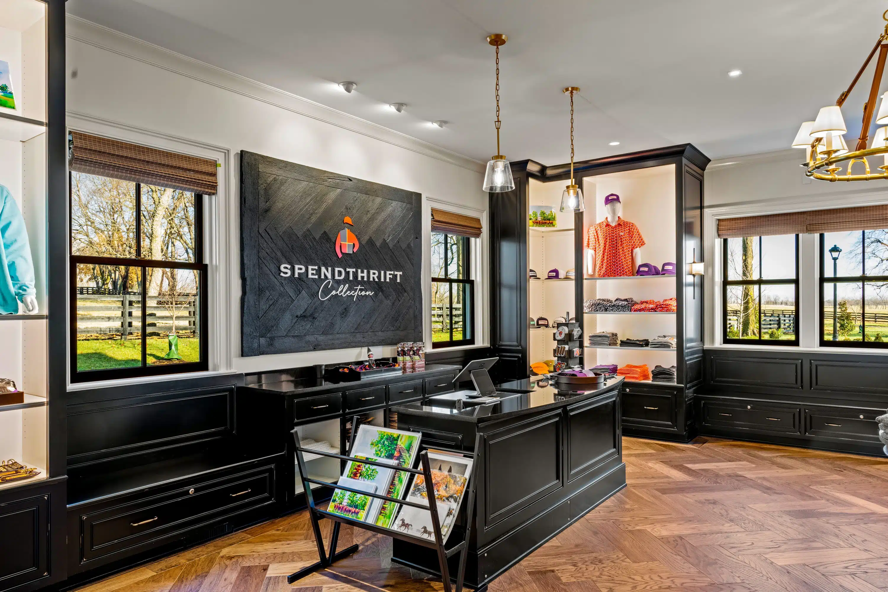
Bold colors like red, dark blue, and black stand out well against a white background. If you opt for a black background for your sign, you will need to use bright colors that will stand out the best against a dark background, like white, yellow, or light green. Avoid using similar or muted colors for your color selection.
Color Harmony
Your color selection can also do a lot to evoke emotions and convey important messages. You want to ensure that your colors work together in harmony to maintain a visual balance within your design elements. Oversaturating your signs with too many colors can be hard to look at.
With color harmony, you’ll want to focus on three main color selection elements:
- Main color
- Accent color
- Neutral color
Color harmony often follows a set theme relating to the business branding. It can also pertain to the desired psychological impact your signage will have on its target audience. For instance, bold colors for a gym or tranquil coloring for a day spa.
Typography
The type of font you choose can also drastically impact your sign graphics. You want your signage to be easy to read; otherwise, it completely defeats the purpose. So, it’s best to stick with clear and uncomplicated font text.
Don’t use fonts that are too fancy or ornate, as these can be difficult to read. You’ll also want to steer clear of using too many different types of fonts, or this can create confusion over the message of your business branding.
The size of your fonts is also an important aspect. You want to verify that the most vital parts of your sign can be easily read from a distance.
Whitespace
Often, what you don’t put into your signage is as equally important as what you do. Don’t underestimate the significance of whitespace in your sign graphics. Whitespace is the act of intentionally leaving space on your signage without text or sign graphics.
Utilizing whitespace helps your sign achieve visual clarity. Allowing space on your sign lets it flow and breathe naturally. This helps to cut down on visual clutter.
Proper whitespace usage permits you to pull the attention of viewers to the areas of your sign graphics you want the most focus on.
Simplicity
When it comes to the design elements of your signage, sometimes less is more. A good sign is straightforward and to the point. This is true for coffee shops and apparel stores alike.
Simple sign graphics can even have a noticeable impact on events and venue spaces. A well-crafted yet simple sign design can add visual appeal. It lets you make your business branding known in a big way.
You’re aiming for simpler design elements that are easy to remember. Your signage should focus on the core message of your business to prevent visual information overload.
Images and Icons
Be mindful of the imagery you put on your business signage. You want your sign graphics to be relevant to your business branding. Anything that doesn’t relate to your business on your sign is just taking up space.
Select an image or an icon that is clean, high-quality, and simplistic. It should be instantly recognizable and catch the eye of viewers. Don’t use overly complex imagery as you may only have a brief amount of time to make an impression on your target audience.
Your sign graphics should be large enough to see from a distance without being overpowering to the rest of the sign.
Visual Hierarchy
Visual hierarchy is a cornerstone of good design for sign graphics. It ensures all of your design elements maintain a sense of organization and an order of importance. With a clearly defined visual hierarchy, you place an emphasis on which areas of your sign graphics you want consumers to focus on first.
For example, a retail store advertising a big sale may choose to place an emphasis on the “sale” portion of the sign graphics in big, bold lettering and brighter colors. If there is a targeted percentage like “75% off,” this can also be featured in bright colors to catch the attention of passersby.
Brand Consistency
Brand consistency is a crucial part of your sign graphics. You want to use the same color scheme on your signage materials as you would for the rest of your business branding.
If your business follows a color scheme of light blue and white, this is the same color selection you will use for your signage. You will also want to maintain the same logos and fonts to create a consistent brand identity.
Establishing brand consistency helps customers recognize your brand much easier and builds up customer loyalty. The unmistakable gold and red imagery of the McDonald’s logo is a prime example of this.
Amplify Your Business Branding with Custom Sign Graphics from Nimlok Kentucky Today
Your signage materials are a reflection of who you are and what your brand has to offer. Having the right sign graphics is an integral part of your business. High-quality design elements are a must to look professional.
At Nimlok Kentucky, we specialize in custom signage, branded corporate interiors, trade show booths, wall coverings, and so much more. If you can dream it, we can make it come to life. We are a 100% woman-owned business with over 30 years of experience.
Contact the experts at Nimlok Kentucky, today for more information or to get started on your next project.